Pages

Ian Sands has taken a new position at South Brunswick HS Check out it out! http://ArtofSouthB.com
Showing posts with label Student Spotlight. Show all posts

Monday, November 17, 2014

Dark Closets, Risks and Paper Cuts: Student Spotlight


Dark Closets, Risks and Paper Cuts

For my Artists Solve Problems final, I chose to take risks and do something really unfamiliar. I limited myself to doing only light drawings and then having to layer them altogether to create a final image. This was my problem/limitation that I had to overcome, which I did, by just changing my plan a bit and getting some help along the way! Originally, I was going to draw the entire skyline with a light and that was a struggle, but this was still something I really wanted to do.. So, I decided I would take sheets of paper, cut out an outline and windows and then layer them all for the final using Photoshop. I had some help photographing along the way!


 I applied different opacities, brightnesses, etc. to each one. The one above, I believe, is my best.

So after I had finally finished my light drawings and had all of my images I came across my next problem... Photoshop. Something I was really trying to avoid... I don't know why, but computer art and using Photoshop really intimidate me. Like I said, unsure of the reason, because I know that it can really create some amazing stuff and I edit photos all the time. But just having to create an entire project with it? Like I would have nothing unless I sucked it up and layered them together.


 Even then, I didn't know how it would turn out, I could still end up with really nothing or something awful, and I tried to convince myself to not do it. I think it may be because I sort of struggled with the technology unit in Art 1? But back then I realized you could do some amazing art, and I had fun with it, but that was when I had a step by step tutorial, this was just a free for all. 


So, with the help of an expert, Mr. Sands, I was able to learn some really cool Photoshop skills. Sure they were pretty basic, but, I feel like I've come away from this with a new technique and I was really glad I experimented with my art making process. This is definitely something I have never tried before, and because of that, the outcome was something I've never gotten before and I am really proud of my final pieces! Here they are:)


Thursday, November 13, 2014

Two Sarah's in Art Two: Student Spotlight


 Unwilling Administrators, Angry Custodians, and Herds of Wild High Schoolers

You could probably say that working with perspective was my limitation and therefore say I was solving a material problem, however I feel my project solves a design problem. "The Fun Theory" videos feature people making everyday boring task more entertaining by using art. Here at Apex hundreds of students roam around the school while going from one death trap, sorry i mean class, to the next. I figured seeing a piece of art in between the journey may make the walk more fun or at the very least more bearable. 

As mentioned before, this project was the epitome of bumps and mishaps. We, Sarah and I, had to face unwilling administrators, angry custodians, and herds of wild high schoolers. Before starting the project, we had to get permission from administration. They at first shot our idea down, but we compromised and used chalk instead of paint. After getting our idea approve we went to tape the stairs and mark the outline of the A, but the next day the tape was gone. The custodial staff took it down and yelled at us. However, we explained to them that we got permission and we continued on. Lastly, we had people constantly going up the stairs, but we just worked around that.


This project was a collaboration with my friend Sarah. Working with Sarah made the process much more efficient. We were able to get more done in a shorter amount of time. Having another person to work with also came in handy when trying to put the tape down on the stairs. One of us would stand at the bottom of the stairs and direct the other where to place the tape. I imagine this would be 10000x harder to do alone. It would also probably take ages.

Monday, October 20, 2014

Student Spotlight - Sarah B - Artists Steal

Before I started the artists steal project, my answer to this question would be that stealing is copying someone else's ideas and claiming them as your own. Now that I've done this project, I realize how wrong I was. Although copying and stealing can seem very similar, they are very different. Copying is taking a piece of someone's artwork directly to put into yours, like tracing an outline, and turning it into something creative and unique while still resembling the original piece. Stealing refers to when you take a person's artwork and claim it  and that person's ideas as your own.


For my character remix project, I combined Timmy Turner from the Fairly Odd Parents with Blossom from the Power puff Girls. I copied the main parts of Blossom's outline by tracing, like body and eyes. I also traced Timmy's mouth on the new face and attempted to make his clothes look good on the new body shape so that it would still look like him. Overall I like how it turned out and it's funny to see different cartoons I watched as a kid come together as one character.


For my final project, I made a lion out of food wrappers. Since the project was artists steal, i traced the outline of Simba from the Lion King as the base for my artwork. Then i collected a LOT of wrappers that were orange, red, and black to use on his body. I painted on his eyes, nose, and mouth to  make him look more like the real thing. The idea behind this artwork was a pun or play on words. He was a lion made out of food, so he was a food lion. ha. Like the store. I really enjoyed making this project and it turned out just how I wanted it to.

Friday, October 17, 2014

Student Spotlight: Sarah D - Artists Steal

"Is copying okay?"

"If you copy methods or basic concepts than it's okay. Copying exactly what someone else did is not," was my previous answer to this question. My new opinion builds off this idea. I now feel that copying is okay depending on the extent of said copying. To me there's a huge difference between taking a piece, copying it, and adding one or more elements that are different verses copying something exactly how the original creator made it. The slightest difference can change the mood or message of a piece and therefore making it a completely different idea. 


My character remix was based on Alice from "Alice in Wonderland". I decided to make her as an asylum patient because lets be real, if some girl was to tell people about her experience of falling down a rabbit hole, stalking a talking rabbit, and meeting a queen who has card soldiers, her mental stability would be questioned. I also decided to add the Cheshire cat's face in the background because I wanted it to look like the memory of her experience forever haunted her slowly driving her more insane. 


For my final project, I decided to make the Abbey Road album but with actual beetles as The Beatles because  a) i love The Beatles and b) puns are great. The value I think my piece beings is a fresh take on an iconic image. It's the literal version of the cover. If someone, who didn't know much about The Beatles, was asked to imagine The Beatles crossing abbey road they would mostly likely imagine something like what I created. My piece is a different perspective of "The Beatles crossing Abbey Road".


Friday, September 12, 2014

Artist Observe: The Stakeout!


This project was originated from the PBS show, The Art Assignment and their visit with Chicago-based artist Deb Sokolow. Deb's art is all about observing people and then documenting what happens. Our current unit is Artists Observe so this seemed to fit right in!

For this assignment, we asked our Apex artists to place an object in a public spot where people can interact with it, observe what happens and then document their experiences. Here are a few examples of what our artists accomplished...

-------


I decided to set out a bowl of candy with a sign reading,"Take one! Have a sweet day!' on a fountain near our local Moe's to see people's reactions. Almost immediately the bowl grabbed people's attention; several kids picked up the bowl only to set it back down on their parents' insistence.

 This begs the question, why were parents so cautious towards individually wrapped sugary confections? I believe I have the answer. In 1982, a series of murders in Chicago rocked the country; these random killings are known as the Chicago Tylenol Murders or TYMURS by the Federal Bureau of Investigation. The murders were a series of random and intentional poisoning deaths of victims who had taken Tylenol. The killer opened the capsules and laced them with Cyanide and put them back on the shelf, killing whomever took the pill. The parents were cautious of the candy due to the lasting effects of TYMURS, but the kids succumb to peer pressure. So, would you take the candy or just leave it in the bowl?

~Angela

-------


I put doughnuts in downtown Apex and watched and took pictures from a nearby table. One thing about stalking that pictures don't show is how frustrating it is! So many people walked by and didn't see the doughnuts! But finally after half an hour or so people walked by and I have pictures of adults looking at the doughnuts and a kid ran up and touched them and her mom pulled her away! I learned its hard to get peoples attention but it's easy to take pictures without them noticing.

~Meredith

-------

This morning, I put a can of bread on a table at my church. However, I was so sad because no one even noticed my can of breadcrumbs. A lot of people simply looked at it, but they didn't interact with it like I was anticipating.

~Sadie

-------

My assignment was to set an object out and see if people would touch it. Not surprising, I found that people were not as trusting as you would want them to be. I sat in front of the public library about 10ft away from a can of bubbles that I had wrote "play with me" on top of. I watched as adult and kids walked by but no one would touch it. I opened the cap to see if when people could see that it really was just bubbles that maybe they would play with it. They did not.

Overall it surprised me how much people either don't trust others or are afraid of being laughed at. Most parents told their kids no before even taking a second glance at the bottle. I learned that people would rather be boring than risk being embarrassed or taking a couple seconds out of their schedule to play.

~Sarah B

-------


On the sidewalk, I place a notebook with instructions for the discoverer to write their favorite song and place the notebook back. Creepily I watched from the window, taking notes and hoping not to be seen, because that would be quite awkward.

What happened:
3:00 pm- Stakeout begins
3:27 pm-A tall man with a baseball hat walking his dog passes by. He stops briefly, but continues to walk past.
4:11 pm-A little boy, maybe around 5 years old, and his mother walk past. The little boy picks up the book and tosses it, about 2 feet. The mother looks at the boy and says something, possibly asking what the book was or telling him not to throw things.
5:00 pm- Stakeout over

Essentially what I discovered is that I live in a neighborhood with a bunch of hermits who don't like to leave the presence of their homes, considering in two hours only four people were spotted. No one even opened the book. The little boy had the closest interaction.

~Sarah D


Tuesday, August 5, 2014

Five Things Every Apex Artist Should Know!

Whether you are brand new to Apex Art or going to be taking your third or fourth art class, there are certain things we all have in common. Here is our Top Five List of things every Apex artist should know!


#5. We Blog

If you are new to Apex Art you should know that all Apex Artists create and maintain a blog. This year we are are switching over from our old blogging platform, blogger, and migrating to a new platform, Weebly! Weebly is much easier to use and allows for multiple blogs on one page. This means you can create buttons for all your different art classes! 

Want to get a head start? Create your Weebly blog today! Make sure you set it up right by following along with this easy, short online tutorial!

Are you in an advanced class and already have a blog? No problem! You’ll have the option to either switching over to Weebly (recommended) or keeping your old blog. Talk to your art teacher.


#4. We Maintain Sketchbooks

Sketchbooks are used for everything from completing warmups to creating thumbnails, designing projects and even storing references. You'll need your sketchbook almost every day so you will want to get one right away.

You might even consider buying a sketchbook before school starts and the mad dash is on! Look for a spiral bound sketchbook as they tend to hold up better than the others.


#3. We Utilize the Portal!

The Art of Apex Portal is a one stop website where students can find art inspiration and easy to follow online tutorials. The Portal is divided into four sections.

What Should I Created: The first section of the portal is an extensive lists of links designed to help the student search and find inspiration for an upcoming project.

How Do I: The second section contains an organized list of short (less than five minutes each) video tutorials to bring the student quickly up to speed on all sorts of art techniques.

What I Think: This section describes the Artist Behaviors every Apex Artists will need to know. We uses this information to grow as artists and evaluate our work when writing our blog posts.

My Class Website: Last but not least, this section provides direct links to each individual class website.


#2. We Are Online!

Follow us on Twitter @ArtofApex
Like us on Facebook Facebook.com/ApexHighArt
Check out the blog! http://www.ArtofApex.com/


#1. We Are Never Basic!


If you are basic, don't worry! There is a short video explaining how to not be basic. Watch it now!


.

Friday, June 13, 2014

2014 Reflections: Part Two - Favorite Medium

Which medium did you most enjoy working with and why? 


This semester the medium I enjoyed working with the most was oil pastels. Although they can make your hands pretty dirty I enjoyed working with it because of the many techniques it allows. For example in the Space-theme project I used oil pastels.For the planet on which the aliens are standing, I used the scumbling technique, and by applying it many layers, it gave the planet a unique texture and let it seem more realistic. For the Saturn planet I used techniques like burnishing and added highlights to make it seem like the light from the spaceship was falling upon it.


For the 2 in 1 project I also used oil pastels which stood out and contrasted well with the black and white text background. I liked how oil pastels burnish when you apply it in layers to create a vibrant color and unique texture. Using this technique I colored the flamingoes with peach red yellow and white oil pastels.it burnished well and the flamingoes had a natural color.

Overall I like how vibrant oil pastels can be on paper because it helps produce a contrast in your artwork. I like how if you make a mistake, you can simply add more layers of oil pastel to cover it up.I also enjoyed exploring highlights,core shadows and cast shadows in one of our warmups with oil  pastels.
 ~Anam


------

Fire!! Thats all I really have to say. It was the most risky medium I have worked with. My portfolio is basically, acrylic, pencil, acrylic, acrylic, FIRE! 

I really did not think my plan would work, which it did fail the first attempt but second time was exactly how I imagined it would look- actually better. It was great for lighting and gaining the audience's attention. It gave a great feel to my piece, just how I people feel excited during a circus performance. 


During the D.C trip in the gift shop of the contemporary art museum, there was a book called Food Art. I just flipped through the pages thinking- How did I not think of that?! Food Art is brilliant, and the possibilities are infinite. There was just bananas suspended in the air and a light above them so on the floor was a shadow of a monkey (haha I am the banana girl). Absolutely genius!

~Michelle

-----


My favorite medium by far is colored pencil because it allows me to draw with precision while I am still able to mix colors and blend like when using paint. Also, at the end of the year, I made a colored pencil piece with white pencils on black paper which I really enjoyed because I had to emphasize the light values rather than the dark values on a normal colored pencil piece.

My biggest regret about this semester is limiting myself to colored pencil as medium. I wish I would have explored new mediums because I may have found a new favorite one. A few mediums I would have like to tried are watercolor, stenciling, and mixed-media/collage. 


~Anna

-----


I enjoyed working with the cardboard during this semester. Working with the cardboard allowed me to make one of my favorite pieces that I made during this class. Cardboard is a very interesting media to work with, because mistakes cannot be reverted, and you only have one way to change the way it looks. 

Due to how simplistic cardboard is, it makes it look very easy to reach your vision for the artwork. I was only able to create one piece with this media, (shown above) which I feel turned out very well.

~Chris


-----

Over the course of the year I got to work with a lot of different medium that I either haven't worked with in a long time or at all. My favorite medium that I got to work with this year was the duct tape

During the perspective project our group decided to work with duct tape as our medium. It was a lot of fun I've never thought about completing a project with duct tape before. That was probably my favorite because it was something new and different to work with and it was a group project so I got the chance to do it with a bunch of my friends. 


~ Madyson

-----

Monday, June 9, 2014

2014 Reflections: Part One - Most Successful

As we close out the school year here at Apex Art, we asked out students to reflect back on their work over the semester. Here are some of their responses...

----------


What was your most successful project this semester? Describe the project and your work, then explain why you picked it. 

My most successful project this semester would probably my two into one project.  For this project we had to choose two feelings/emotions or two objects and make them one.  I decided to do two emotions of beauty and pain.  I wanted to do these two show that something may be beautiful, but can be experiencing pain at the same time.  I decided not to have any color except on the harmed parts.  I think this was my most successful project because I spent a lot of time on this project and at times I had to just start over and it was a lot of effort.  But it was worth it in the end because I love the outcome and wouldn't change a thing about it. ~ Brittney's Blog


---------- 


My most successful project was my news project. I really liked the idea of my project and it turned out really well. I was nervous at first cause I've never drawn a person before and a lot of people aren't good at it. I spent a lot of time working on different aspects of a face using a facial expression book. I'm glad I decided to do this project though because it's one of the best I've done. For this project I used charcoal which I'm not too experienced with. I did a project with it last semester but that's the only prior experience I had with charcoal. I think I could have more value in my drawing but I was scared to use the 6B because if you mess up there's not much you can do to cover it up. I used darker values in the neck and the hair but not much on his actual face.

----------


I find that my time project was the most successful. It was a completely original project that stemmed from my own fascination with the wonder of flight, and through this shows my level of creativity, as well as my ability to find a way to make this rather ambitious idea work. It also conveys the light-hearted message I was trying to portray through it. The fluffy cloud background and the focus on how the plane elegantly rises and falls on the wind as it sails smoothly through the sky illustrates calmness and tranquility as your mind floats along with the airplane. This piece conveys my originality and message much better than any of my other projects throughout the year have done. ~ Kimberly's Blog


----------


My most successful project, in my opinion, was my Identity Project. The project is supposed to be what goes on in my mind most of the time when i'm daydreaming, or dreaming in general. The media I had used was markers and pens which is my favorite media. I picked this project as my most successful because it shows most of my skill, especially with  colouring and style. It has the most characters and took me the longest time to do. I am very proud of this work and it is just so important to me. Its a very big picture, almost a poster, and having something represent me (my mind) means a lot. ~ Nory's Blog

----------
    
My most successful project was probably my "lightning bugs" project I did at the beginning of the semester.     I learned a lot of new processes while working on this particular project. I had never really used photoshop before and my teacher wanted me to challenge myself with different mediums such as this. I also got the chance to try out a different technique for creating art, and that's by using the photocopier to print and take pictures of still life pieces and layer the different copies so they create a whole new picture. I didn't work with very many materials that were familiar to me so this was a new experience but I really enjoyed learning about photoshop and all the different things I can do to make a picture like this one come to life. I wasn't sure at first if using photoshop and actual still-life pieces was a good idea, but my teacher convinced me to play around with different objects on the photocopier and when I found a setup that I was satisfied with, I was extremely pleased with how the project came together.     I could have just as easily said no to using the photocopier and just painted something similar to this piece with acrylic or watercolor paints, but since it was a brand new class when we started on these projects, I thought it was time to step up my game and risk trying something new.

Friday, May 23, 2014

Mural: Making Technology Appealing to Women

By Rachel


Instead of working on the Parallel assignment, I'm creating another mural, a project that spun off of our previous chalk mural.

While Hannah, Jessica and I were working on our chalk mural in the courtyard, a teacher approached us about working on a mural in her room. She teaches computer classes and said that for years she'd been wanting to paint a mural in her room to help make the technology classes more appealing to women. She explained that women make great programmers but they often don't chose that course of study because they feel uncomfortable in that environment/ feel as though they don't belong . 


Later in the week we went to look at the wall she had in mind and started sketching out our ideas. At first we were thinking about doing a landscape of some sort, but then Hannah suggested something more graphic and bold that would have a larger impact on the space. She found this picture for inspiration (see above).


We loved the bright colors and the organic shapes, and plan to also incorporate bubbles and fish to the leafy background. Instead of using the darker hues as our background, we switched to turquoises which girls in the class said were more appealing to them.


This past week we started painting the background color of the wall, a mix of three tints of turquoise. We also blocked off the wall to look like a portal to further the illusion of being under the sea.


See more of Rachel's Art on her blog!


Friday, May 9, 2014

Perspective Mural : Pride


Perspective Pride
By Rocio

Our idea was to spell the word pride out but it's only legible if you look at it from a certain angle. At another angle it just looks like random scribbles. My group members are Michelle, Madyson, Ryn, Marissa, and Brittany. Michelle cut out the letter on cardboard and we use that to mark on the wall. It's a little bit complicated but over time we have gotten the hang of it.


Wednesday, May 7, 2014

The Wolf Sings


Singing Animation
by Kimberly

For the past two weeks, we have been working on our second animation project. We had to choose a song, recommended 30 sec, and animate the mouth of a picture or drawing to make it sing along to the song. I drew a basic wolf head to act as a base for the different mouth movements, and drew the mouths and eyes separate so I could add them on later. 

After I had all the basic mouth positions, I imported all the images into flash, and set the frames up to match the words in the song. The result was a pretty believable animation. However, some of the images in the frames were off center, so the picture shudders, and I'm not sure how to fix it.


Monday, May 5, 2014

The Fine Arts League of Cary Teen Show

Congratulations to Ashlyn for her Third Place win in the The Fine Arts League of Cary Teen Show! 
 
The exhibition will be on display from May 3-June 3 
Frankie G. Weems Art Gallery 
142-2 Gaddy Hamrick Art Center, 
Meredith College, 
3800 Hillsborough Street 
Raleigh, NC
 
The Boy in Blue: Image Transfer on Canvas
 For this project our theme was up close and personal. When I first thought of that I thought of noses. To get my reference I googled up close pictures of noses. As we all know google never comes up with exactly what we ask for. The search came up with noses all either too close or too far away for my liking. There was one picture that was a  picture of camera taking a picture of a nose. I then changed my focus to cameras. I googled cameras and it also came up with security room screens. And thats what I decided to do. I painted a wall of blank screens on to 3 separate canvases and took 33 pictures of my little brother.
Using the pictures I did a photo transfer onto the canvas "security screens". I glued the pictures face down and let them dry for a day. I then rubbed off the paper and the picture transferred onto the canvas. But as you would know if you have done a photo transfer before, the picture isnt a carbon copy of the original picture. Part on the picture comes off with the paper. Surprisingly I feel that this only enhanced the piece even more creating an effect that the tv screens were old and were snowing.   
I demonstrated emphasize in my art work by going over my little brothers blue shirts with a light blue water color. This emphasized that it was the same kid in every picture and made him stand out. Oddly enough I hadn't planned on making everyone of his shirts blue in the pictures. It just happened that almost every picture I had token of him he was wearing a blue shirt.

Sunday, April 27, 2014

2014 Teens, Inspired exhibition at the NC Museum of Art


Congratulations to the following Apex artists who have been selected to be part of the 2014 Teens, Inspired exhibition at the NC Museum of Art!

The NCMA had over 100 entries- the largest number of submissions since the exhibition began 4 years ago. The jury chose the following works to be hung at the North Carolina Museum of Art Summer- Fall 2014 based on creativity, connection to the work that had inspired it, and artistic merit:


Brittany Baril
Mummy in the Afterlife

The inspiration for this piece was the False Door of Ni-ankh-Snefru. I saw the piece and was more inspired off of its history than anything else. The door is meant to be used as a passageway for the soul of a deceased person to travel between the afterlife and the world of the living.


---


What’s the Pointe?

My What’s the Pointe drawing was inspired by The Classical Collection, specifically including pieces such as the Torso of Aphrodite and Aphrodite of Cyrene. These two pieces are sculptures of the female body influenced by the Greek and Roman culture.


---


Hannah Siegel
Shades of a Day

My piece, “Shades of a Day”, is inspired by Monet’s classic painting, “The Cliff”, an oil painting completed in 1883.The theme for this assigned project in my art class was “Time as an Element,” in which somehow our piece had to incorporate time. I was immediately drawn to Monet’s series of paintings that he created, using various colors to portray different emotions throughout different times of a day, something that is very evident in “The Cliff”.


---

Monday, March 24, 2014

Student Spotlight: Nicole - Art 1

Student: Nicole
Blog:  http://apex-2014-nicole.blogspot.com/
Class: Ms. Sudkamp's Art 1

Project:  2 or more color linoleum printmaking.


Artists Reflect- Process

After I finished carving the places that I wanted to have pink, I printed it on a page. I saw some spots on the print that I didn't want have there. So I went back and carved out some more and then reprinted. I also noticed that I needed to add more ink so that it the print would come out better. When I was doing my second color of the black ink I notice that something was wrong when I printed it. It came out really blotchy and wasn't sure if it was become I used to much ink. I decided to change the ink that I used and it turned out a lot better. Before I put the new black ink on the print I tested out it out on scrap piece of paper to see if it would turn out how I wanted it to.


Artists Communicate Trough their Work-

For my art piece I did hanging pointe shoes. I chose this because I have been doing dance since I was three years old and wanted to make something that meant something to me. As of sixth grade I started doing pointe and I really enjoyed it, even though it can cause my feet pain! My art work is intended to show about me and show how dance has been an important factor of my life. I chose pink as the color because it is my favorite color. The issues that am examining through my artwork is to show that even though something that can be painful can be beautiful. My artwork also says that by practicing and doing what you love to do can turn out into a beautiful dance. And that all the hard work and painful practices is worth it. 


 Linoleum Block


Drawing


4 Blocked Print


Single Print


Friday, March 7, 2014

Student Spotlight: Hannah - Art Three

Snapshot post- Appropriation

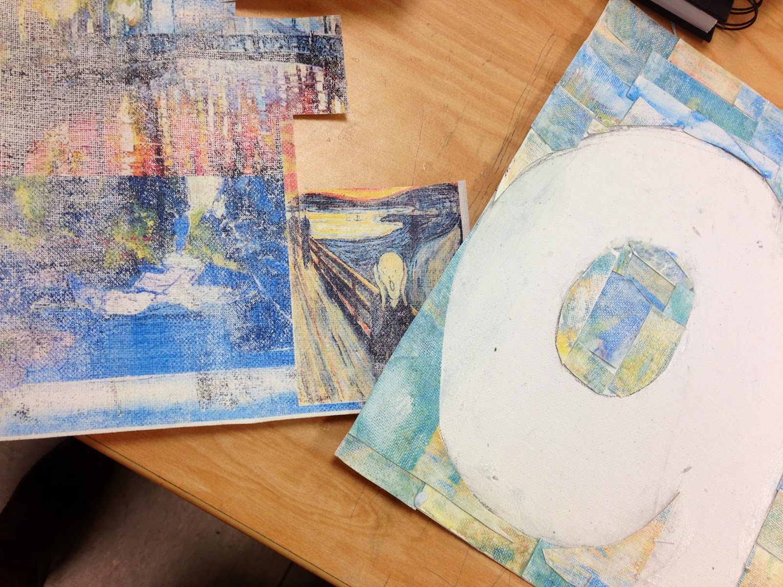
For the new semester, for each assignment, it is our new goal to provide "snapshot posts" so that we can track our progress, reflect on how we have grown, and see where we need to go from here. For this project, our theme was Appropriation, which is the use of borrowed elements in a new piece. We were allowed to use any material that we thought would best get across what we wanted to express with this theme. The idea that I came up with and was most inspired by was "ClipArt."


So far, I have crafted the idea of spelling out "art" using clips of famous artwork. Eventually, all three letters will be hung up with clips on twine so that it has a literal and figurative meaning of "clipart."


I think that this project is really coming along. I love the idea that I have and am super inspired by it so I can't wait to see where it will go from here. Mr. Sands really wants us to understand how artists grow with each piece of work they compose so he asked that we reflect on how we have grown throughout the project. Here are three Artist Behaviors that I believe I have taken a part of during this project to make the final piece more successful.

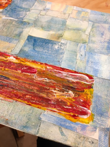
Artists Take Risks: For the material that I am using for this assignment, I chose to use canvas paper that Mr. Sands found in the depth of all his random art supplies. This is something that I have never worked with, so this whole project has been a huge experiment. I didn't know how the canvas would react or even if it would work, so it was a huge risk. I truly believe that in order to grow as an artist, it is very important to step out of your comfort zone, whether that mean trying a new technique or using a new material. I am loving the freedom of just experimenting with it and seeing where the material takes me!

Artists Solve Problems: As I just stated, the materials that I chose for this project were totally new for me, so I didn't know exactly how things would work out. Needless to say, things didn't go perfectly as planned, but I took those flaws and ran with them! For example, when I printed out the "clips" of artwork on the canvas paper, the colors were not as vibrant as I had previously expected. I am definitely taking advantage of this setback, however, as I think that the paler colors make a really great background that will place a lot of emphasis on the letters when they are finished.

Artists Understand the Art Community: I don't normally use technology in my artwork a lot, as I am pretty technologically challenged. I think in this project though, the use of technology has really benefited the piece. Through this project, I have learned a lot about how technology can enhance a piece, as I was able to print the images directly on the canvas paper.


Appropriation Final


So my final project for the Appropriation project is completed! I don't have a picture yet, but I will post one as soon as I get it! I am very happy with how the final piece turned out and I think that it really displays my view as an artist. Mr. Sands has been teaching us about certain qualities that artists possess, so I have chosen three of these qualities that I believe my piece portrays.

Artists Create Original Art: My idea for the project was "Clip Art." This was a completely original idea that I developed when faced with the theme of Appropriation. I was really inspired by the idea so I started brainstorming how I could get my idea across. I had to think very creatively to develop a game plan for how I was going to do that. I think that one of the reasons why I am so happy with the final piece is that I can see all the creativity and originality it took to complete it.

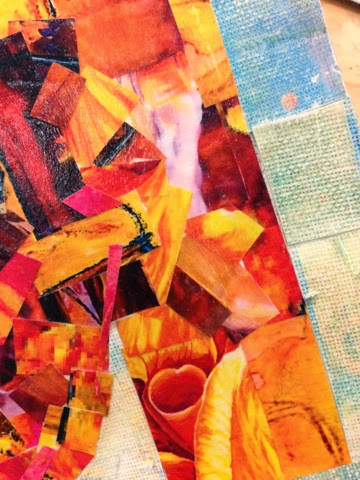
Artists Develop Art-Making Skills: When I had the idea for how I was going to incorporate the theme of appropriation, I knew right away that I wanted to use mixed media as my medium. I thought the best way to show the idea of works of art inspiring other works of art (clip art!) could best be displayed through using mixed media so I could use actual pieces of art in the design. I have worked with mixed media before, but not often, so I really wanted to broaden my knowledge of the topic and use other materials. I think that with this project, I was able to gain the experience of incorporating different elements in unique ways, but still in a cohesive way.

Artists Collaborate: With the middle letter, R, I didn't know if I wanted to use the same material that I had been using for the other two letters, or if I wanted to use acrylic paint. I asked a couple of the other students in my class for their opinion, and the most valuable advice that I got was to do what I was most inspired by. I think that that is key in all pieces of work, and the advice at that given time was what I needed to hear. I had been too focused on what I thought looked good and not on what I as the artist felt moved by. In the end, I chose the paint because I thought it would show good contrast, and also, I just really wanted to paint! I am really pleased with how it turned out and am glad that stuck to what I was inspired by.


The "Student Spotlight" posts are excerpts taken from our student blogs.
You can see more of Hannah's Work Here!
You can see all our student blogs here!


Related Posts Plugin for WordPress, Blogger...