Pages

Ian Sands has taken a new position at South Brunswick HS Check out it out! http://ArtofSouthB.com

Friday, May 30, 2014

Preparing for The Art of Apex High: Halle Exhibit


Artists at Apex High School have only today and tomorrow to complete and turn in their art work if it is to be displayed in the Art of Apex High exhibit at the Halle Cultural Arts Center in downtown Apex. 

The show, which will display works by both current students as well as alumni, will open next Friday with a reception on Friday, June 6th from 6 to 8 pm.


Friday, May 23, 2014

Mural: Making Technology Appealing to Women

By Rachel


Instead of working on the Parallel assignment, I'm creating another mural, a project that spun off of our previous chalk mural.

While Hannah, Jessica and I were working on our chalk mural in the courtyard, a teacher approached us about working on a mural in her room. She teaches computer classes and said that for years she'd been wanting to paint a mural in her room to help make the technology classes more appealing to women. She explained that women make great programmers but they often don't chose that course of study because they feel uncomfortable in that environment/ feel as though they don't belong . 


Later in the week we went to look at the wall she had in mind and started sketching out our ideas. At first we were thinking about doing a landscape of some sort, but then Hannah suggested something more graphic and bold that would have a larger impact on the space. She found this picture for inspiration (see above).


We loved the bright colors and the organic shapes, and plan to also incorporate bubbles and fish to the leafy background. Instead of using the darker hues as our background, we switched to turquoises which girls in the class said were more appealing to them.


This past week we started painting the background color of the wall, a mix of three tints of turquoise. We also blocked off the wall to look like a portal to further the illusion of being under the sea.


See more of Rachel's Art on her blog!


Thursday, May 22, 2014

Parallel Project: Production

For the Parallel Project, our artists were asked to find a news story and create a work of art that uses metaphor and allusion. Here is a look at a few of the sketches and works in progress.


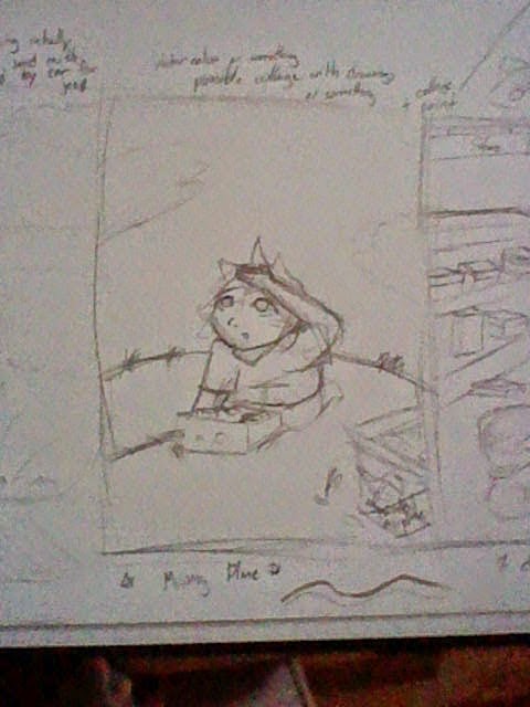
"I had the idea of using the airplane that went missing. I'm making a multimedia of a boy looking up at the sky with a remote control in one hand. He's searching for his model airplane, but it's nowhere to be seen."  ~ Brittany


"This piece of artwork will represent the hasty tensions between the United States and Russia during the Space Race in the '60's. The metaphor is to be that it looks like a comic and that they are threatening each other with Ray/Space guns". ~ Jacob


"I decided not to pick a specific news story to base my project on, but a modern downfall. I chose to use the idea of unhappy marriage and put a fairy tale twist to it. The idea I'm going with is Happily Never After. This is a series of 5 works that show how the Disney Princesses don't get happy endings either. For Belle, she will be sitting in her library reading with a fire roaring in the fireplace and Beast's head mounted to the wall like a trophy." ~ Ryn


"My idea for this project was the South Korean ferry sinking. What struck me the most is that over 300 students died and the captain and crew members survived!  So I wanted to portray the part of the obedient high school students who listened to the crew and stayed on board rather than trying to escape and be rescued.  The students I made as sheep that were innocently following orders, and the captain and the crew to be wolves that only looked after themselves and risked the lives of others for personal gain." ~ Jessica


"I wanted to do something about my home country, Egypt. I decided to make a project involving the revolutions that have been going on for the past 4 years.  The past revolution put us back to the start if everything we had accomplished from the previous revolutions because it was for bad reasons. I decided to have a meaning behind a troubled man. First I would have the man breaking through a wall as if he had been trying to get through it for a long time. Secondly, while he is half out I want him to have face planted into a long pole as of he had been surprised of the outcome". ~Nora


Tuesday, May 20, 2014

Art Education: Beyond the Pencil

The old blue prints are out the window and at Apex High School we are laying down a new set of plans that are setting the world of Art Education on its ear. Simply stated, we are no longer interested in making art but rather, making artists.

The Open Art Room is a concept where students no longer follow step by step, recipe type art projects but are encouraged to communicate ideas and take risks in a self-directed learning environment.

Are we geniuses who thought this all up? Well, some of it. However, we are really good at borrowing and synthesizing concepts.  We merged great ideas from PBS Art 21 and Choice-based teaching methods like Teaching For Artistic Behaviors (TAB). Here are some of our foundation methods.

Theme Lessons: Starting with a big idea or questions allows the students to conceive meaningful art. We're not just drawing puppies here. We are creating art that communicates to the audience.

Choice in Media: Gone are the days when art was all about paint on canvas. Anything can be an art material so why should the teacher decided? Choice in media allows the student to select the materials they believe will best communicate their vision.

Artistic Behaviors: Knowing how to color inside the lines is not what it takes to make an artist. Yes, artists need to have art making skills but they also need to know how to communicate through their work, take risks and solve problems.  At Apex, we developed a list of Artistic Behaviors students use as a guideline when working on their projects.

Reflection: Once the art is created, an artist should be able to intelligently speak about it. We encourage each artist at Apex to track the progress of their work and reflect on finished pieces online. Each beginning student creates a blog that follows them throughout the program.

All of this is not without controversy. There are some that say students need guidelines and boundaries and believe programs like ours simply let children do whatever they want without structure. We say, one look at the innovative work coming out of our program silences these accusations.


Furthermore, we are not alone. Thanks to social media, art teachers with similar views have been able to discuss ideas and even collaborate online. Art teachers like Jack Watson of Chapel Hill, NC and Colleen Rose from Ontario, Canada are developing similar programs with great success.

Monday, May 19, 2014

A Flower! Yay!


Today Michelle brought me a flower. You might ask, "It's a nice flower but so what?" Well, let me tell you a little story. 

 The Art History class recently visited the Hirshhorn Museum in Washington, D.C. to view the exhibit, Damage Control: Art and Destruction. In fact, I recently wrote an article about it for Art of Education. You can read the article here.

By far my favorite work in the exhibit was a video created by Pipilotti Rist titled Ever Is Over. The video piece was created by simultaneously projecting two separate videos onto two different walls with a blurred video overlapping in the middle. The video on the right simply displayed tropical flowers in a field. The main story was displayed by the video projected to the left. In it, a young woman, filmed in slow motion strolls down a car-lined city street. Her summer dress sways as she promenades down the block carrying a long-stemmed tropical flower.


Cheerfully, the girl swings the long stem flower hitting a car window which, to the viewer’s surprise, is instantly smashed to pieces. The flower in the video is actually made of metal. The video is both whimsical and charming, while at the same time violent and tense.


So when Michelle saw this flower growing in her backyard, she picked it and brought it to class. How cool is that!! Thanks Michelle!


Friday, May 16, 2014

Barbie Visits The Museum!

 
Here's a quick look at some of the other things we did in Art History this year...


We did stuff like this...

OK, I'm not really sure what she is doing but she looks pretty happy about it so there you go.


We learned about Romulus and Remus! 


We made kites like this Pop Art inspired kite in progress.


We learned about Egyptian hippos and Jackson Pollock... though I'm not sure they were around at the same time.


And we made some degenerate art. So that was fun!

Thursday, May 15, 2014

Figure Drawing - Life Size!

Students in Ms. Rossi's Drawing class are working on their figure drawing unit. After learning and drawing proportions of the figure, skeleton studies, gesture drawings and self-portraits students are drawing from life. Students were paired up and they were to draw their partner from life and life size. This is a fun project and it is wonderful to see how their drawing skills have developed. 

Monday, May 12, 2014

Chalk Murals Perspective : Final


 This week has been perspective week here at Apex with many of the classes participating in some form of art with a focus on this principle.

This class was challenged with creating a wall mural that incorporated perspective in some way..

Here are the final results...


Friday, May 9, 2014

Perspective Mural : Pride


Perspective Pride
By Rocio

Our idea was to spell the word pride out but it's only legible if you look at it from a certain angle. At another angle it just looks like random scribbles. My group members are Michelle, Madyson, Ryn, Marissa, and Brittany. Michelle cut out the letter on cardboard and we use that to mark on the wall. It's a little bit complicated but over time we have gotten the hang of it.


Wednesday, May 7, 2014

The Wolf Sings


Singing Animation
by Kimberly

For the past two weeks, we have been working on our second animation project. We had to choose a song, recommended 30 sec, and animate the mouth of a picture or drawing to make it sing along to the song. I drew a basic wolf head to act as a base for the different mouth movements, and drew the mouths and eyes separate so I could add them on later. 

After I had all the basic mouth positions, I imported all the images into flash, and set the frames up to match the words in the song. The result was a pretty believable animation. However, some of the images in the frames were off center, so the picture shudders, and I'm not sure how to fix it.


Monday, May 5, 2014

The Fine Arts League of Cary Teen Show

Congratulations to Ashlyn for her Third Place win in the The Fine Arts League of Cary Teen Show! 
 
The exhibition will be on display from May 3-June 3 
Frankie G. Weems Art Gallery 
142-2 Gaddy Hamrick Art Center, 
Meredith College, 
3800 Hillsborough Street 
Raleigh, NC
 
The Boy in Blue: Image Transfer on Canvas
 For this project our theme was up close and personal. When I first thought of that I thought of noses. To get my reference I googled up close pictures of noses. As we all know google never comes up with exactly what we ask for. The search came up with noses all either too close or too far away for my liking. There was one picture that was a  picture of camera taking a picture of a nose. I then changed my focus to cameras. I googled cameras and it also came up with security room screens. And thats what I decided to do. I painted a wall of blank screens on to 3 separate canvases and took 33 pictures of my little brother.
Using the pictures I did a photo transfer onto the canvas "security screens". I glued the pictures face down and let them dry for a day. I then rubbed off the paper and the picture transferred onto the canvas. But as you would know if you have done a photo transfer before, the picture isnt a carbon copy of the original picture. Part on the picture comes off with the paper. Surprisingly I feel that this only enhanced the piece even more creating an effect that the tv screens were old and were snowing.   
I demonstrated emphasize in my art work by going over my little brothers blue shirts with a light blue water color. This emphasized that it was the same kid in every picture and made him stand out. Oddly enough I hadn't planned on making everyone of his shirts blue in the pictures. It just happened that almost every picture I had token of him he was wearing a blue shirt.
Related Posts Plugin for WordPress, Blogger...