The faces behind the artwork because a class isn't about the art, it's about the artists!
Art Two Review 2013 from Apex HS Art on Vimeo.
Apex Art Three Review 2013 from Apex HS Art on Vimeo.
Friday, December 20, 2013

Wednesday, December 18, 2013
9th Day of Photoshop!

On the Ninth Day of Photoshop my Students made for me...
OK I posted on Twitter if any teachers had art they wanted animated, I'd have our Computer Art class animate it for the 9th Day of Photoshop. Just like all the 12 Days of Photoshop, the students only had one day to create these animations.
We had two teachers take us up on the offer:
Tricia Fuglestad's First Graders at Dryden Elementary made these Lima Bean Monsters
Tami Rondeau's First Graders at Southeast Polk Schools, Iowa
made these cool Bird drawings
I let the students choose which they wanted to animate.. just sorry we couldn't do them all! You can download the lesson plan for the 12 Days of Photoshop here!


Tuesday, December 17, 2013
Student Spotlight: Kristin
Student Spotlight: Kristin
Class: Sculpture with Ms. Sudkamp
Blog: http://apex-2014-kristin.blogspot.com/
Low relief, or bas-relief, is when forms are slightly raised from the background. High relief is when the forms are raised at a far enough distance from the background that they look disconnected from the surface. Sunken relief is the opposite of low and high relief; instead of the forms being raised off the background, they are cut deeply into the surface.
For my Relief project, I chose to do an altered book because I wanted to try something different and it seemed like an interesting idea. My piece is a sunken type of relief, since I cut into the book to create a 3D scene. First, I had to choose a book that was the size and thickness I wanted. I drew the design I wanted to make and planned it out as a 3-dimensional picture: which parts were going to be which layer and how thick each of those layers were going to be. I numbered each layer from foreground to background, starting at 1 (the bird) and ending at 5 (the sky). This was also the order in which I would cut them. Then came the long process of cutting the pages. Basically, I would take five pages at the top of the layer, place a cutting board under them, cut the design out until I had cut through the five pages, then repeat until each layer was finished. This part took me at least two weeks to finish. After I had finished cutting the book, I painted the layers in bright colors and painted the rest of the book black. For the front cover and third page, I created stencils that I cut out and traced onto the book, then filled in with silver Sharpie. I also used the silver Sharpie for the lyrics on the first and second pages. For the back cover, I copied the logo for the Coldplay song "Up With The Birds", which was my inspiration for this piece. I used gold Sharpie for the bird and a blue-green acrylic paint that I bought for the circle surrounding it.
I am most proud of two things: that this piece turned out as amazingly as it did, and that I actually finished this at all (at least before the semester ended). The book turned out exactly as I pictured and hoped it would, and there is nothing at all I would change about it.
Class: Sculpture with Ms. Sudkamp
Blog: http://apex-2014-kristin.blogspot.com/
 |
| Front Cover |
For my Relief project, I chose to do an altered book because I wanted to try something different and it seemed like an interesting idea. My piece is a sunken type of relief, since I cut into the book to create a 3D scene. First, I had to choose a book that was the size and thickness I wanted. I drew the design I wanted to make and planned it out as a 3-dimensional picture: which parts were going to be which layer and how thick each of those layers were going to be. I numbered each layer from foreground to background, starting at 1 (the bird) and ending at 5 (the sky). This was also the order in which I would cut them. Then came the long process of cutting the pages. Basically, I would take five pages at the top of the layer, place a cutting board under them, cut the design out until I had cut through the five pages, then repeat until each layer was finished. This part took me at least two weeks to finish. After I had finished cutting the book, I painted the layers in bright colors and painted the rest of the book black. For the front cover and third page, I created stencils that I cut out and traced onto the book, then filled in with silver Sharpie. I also used the silver Sharpie for the lyrics on the first and second pages. For the back cover, I copied the logo for the Coldplay song "Up With The Birds", which was my inspiration for this piece. I used gold Sharpie for the bird and a blue-green acrylic paint that I bought for the circle surrounding it.
I am most proud of two things: that this piece turned out as amazingly as it did, and that I actually finished this at all (at least before the semester ended). The book turned out exactly as I pictured and hoped it would, and there is nothing at all I would change about it.
 |
| MX stands for the title of the album that this song comes from, "Mylo Xyloto." "Up With The Birds" is track number 14. Hence, MX14. |
 |
| Inner Pages |
 |
| Cut portion of book |
 |
| Detail |
 |
| Back Cover |
Monday, December 16, 2013
Proportion and Scale 3D : Production

The Art Two class was challenged with creating a 3D work of art that incorporated either proportion or scale. The medium was left open however, they were giving a theme of "Questionable". Let's take a peak at what they are working on so far....

This is a spaceship made of paper mache. That is rather questionable, especially since the project is about scale and who knows how big a spaceship is...

The spaceship will be sucking up this little guy in a beam of green light. Hold on little guy!!

How to make a giant banana... That's questionable.
Step one: Ball up newspaper.

Step two: Hold it all together with tape...

Step three: wrap it up in plaster..
Step four: Realize it is too skinny to be a banana.. paint it green and make it a bean..

"I want to make a life size wax hand" He says.

A Clay mold of his hand. Wax to be poured into this mold.
That's questionable.
Watch out Girl 2! You'll get wax on your book bag!

That worked out pretty well.

A little guy with great abs...

A cross..

Do you think she is paying attention to her art or watching Mulan? That's questionable.

If you are going to make something with correct proportions, a ruler is not a bad way to go.

Who are these little men and what are they up to?? That's questionable.

They are putting makeup on a giant face..

Small size fish..

A fishbowl .. That's questionable.

Fish in the bowl!

That's questionable.
Sunday, December 15, 2013
Student Spotlight: Jed - Art One
Student Spotlight: Jed
Class: Art 1 with Ms. Sudkamp
Blog Link: http://apex-2016-jed.blogspot.com/
.jpg) Relief art is art that has subtle, yet varying degrees of depth on a two-dimensional background; in other words, the work of art has "layers" to it. There are three types of relief: high, low, and sunken. In high relief, the raised parts of the piece protrude greatly out from the background. In low relief, the depths of the layers are shallow. In sunken relief, the designs or pictures are carved into the background, making it somewhat hollow, rather than raising the designs above the background. My wolf is an example of a low relief piece; you can barely tell that it has multiple layers of cardboard from the picture. I picked a wolf as the subject of my relief piece because it's been my favorite animal since first grade. I love their cunningness, gracefulness and swiftness, the bonding of the individual wolves in a pack and their sense of superiority as top-level predators. I am most proud of the colors that I put on my wolf. I darkened the parts that needed to be shaded, and I was able to successfully blend the many darks and lights of his fur. The direction of the colors also portray the illusion that he is in mid-run. If I could go back and change some things about my piece I think I would change the dark spots on his coat of fur that don't quite match the rest of his fur and also perhaps make his tail more elongated to better express his sleekness
Relief art is art that has subtle, yet varying degrees of depth on a two-dimensional background; in other words, the work of art has "layers" to it. There are three types of relief: high, low, and sunken. In high relief, the raised parts of the piece protrude greatly out from the background. In low relief, the depths of the layers are shallow. In sunken relief, the designs or pictures are carved into the background, making it somewhat hollow, rather than raising the designs above the background. My wolf is an example of a low relief piece; you can barely tell that it has multiple layers of cardboard from the picture. I picked a wolf as the subject of my relief piece because it's been my favorite animal since first grade. I love their cunningness, gracefulness and swiftness, the bonding of the individual wolves in a pack and their sense of superiority as top-level predators. I am most proud of the colors that I put on my wolf. I darkened the parts that needed to be shaded, and I was able to successfully blend the many darks and lights of his fur. The direction of the colors also portray the illusion that he is in mid-run. If I could go back and change some things about my piece I think I would change the dark spots on his coat of fur that don't quite match the rest of his fur and also perhaps make his tail more elongated to better express his sleekness
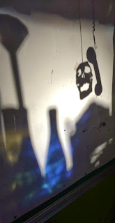 For our shadow art, we used numerous of objects to create shadows, including wine bottles, a skull, a phone, Popsicle sticks, string, diamond, and a PVC pipe with tape on it (see if you can find them in the shadows!). I thought the PVC pipe with tape was really neat and was a surprisingly good idea because when put against the projector with one end of it, the shadow on the board looked like a cross-hair. Hence why the first picture looks like we're duck hunting. Although not represented in the pictures, one image we created had a green background and water-like effect that was made by placing a sprite bottle that was cut open over the projector light, giving the skull a more evil look. The hardest and most difficult part about the project would probably be the idea part of it. It was hard to come up with initial idea of what to do, but once we had an idea, it was quite easy to piece together the necessary items to form the right shadows. Day 2 pictures were most definitely better than Day 1, we had a lot more variety of items to work with and the skull was fun to use as well.

For my perspective piece named "Frozen", I used two-point perspective, where there are two vanishing points, one on the left and one on the right. This gives an illusion of an edge in the center between the "O" and the "Z" where the two "letter walls" are coming together. To start my piece, I drew the center line in the middle of the paper, and drew four diagonal lines to the vanishing points using a ruler. Then, I measured off how much space each letter could take up, where the "O" and "Z" could take up the most space, and the "F" and "N" could take up the least space in order for it to have a two-point perspective effect. After drawing all of the letters with a pencil, I used chalk pastels to color the piece after erasing unneeded pencil marks. I obviously used blue pastels to represent snow and ice, but I also threw in a bit of purple on the border because purple and blue are analogous colors. Smearing and rubbing the pastels afterwards smoothed the colors out and made the letters pop out, the finishing touch to the piece.
Class: Art 1 with Ms. Sudkamp
Blog Link: http://apex-2016-jed.blogspot.com/
.jpg) Relief art is art that has subtle, yet varying degrees of depth on a two-dimensional background; in other words, the work of art has "layers" to it. There are three types of relief: high, low, and sunken. In high relief, the raised parts of the piece protrude greatly out from the background. In low relief, the depths of the layers are shallow. In sunken relief, the designs or pictures are carved into the background, making it somewhat hollow, rather than raising the designs above the background. My wolf is an example of a low relief piece; you can barely tell that it has multiple layers of cardboard from the picture. I picked a wolf as the subject of my relief piece because it's been my favorite animal since first grade. I love their cunningness, gracefulness and swiftness, the bonding of the individual wolves in a pack and their sense of superiority as top-level predators. I am most proud of the colors that I put on my wolf. I darkened the parts that needed to be shaded, and I was able to successfully blend the many darks and lights of his fur. The direction of the colors also portray the illusion that he is in mid-run. If I could go back and change some things about my piece I think I would change the dark spots on his coat of fur that don't quite match the rest of his fur and also perhaps make his tail more elongated to better express his sleekness
Relief art is art that has subtle, yet varying degrees of depth on a two-dimensional background; in other words, the work of art has "layers" to it. There are three types of relief: high, low, and sunken. In high relief, the raised parts of the piece protrude greatly out from the background. In low relief, the depths of the layers are shallow. In sunken relief, the designs or pictures are carved into the background, making it somewhat hollow, rather than raising the designs above the background. My wolf is an example of a low relief piece; you can barely tell that it has multiple layers of cardboard from the picture. I picked a wolf as the subject of my relief piece because it's been my favorite animal since first grade. I love their cunningness, gracefulness and swiftness, the bonding of the individual wolves in a pack and their sense of superiority as top-level predators. I am most proud of the colors that I put on my wolf. I darkened the parts that needed to be shaded, and I was able to successfully blend the many darks and lights of his fur. The direction of the colors also portray the illusion that he is in mid-run. If I could go back and change some things about my piece I think I would change the dark spots on his coat of fur that don't quite match the rest of his fur and also perhaps make his tail more elongated to better express his sleekness For our shadow art, we used numerous of objects to create shadows, including wine bottles, a skull, a phone, Popsicle sticks, string, diamond, and a PVC pipe with tape on it (see if you can find them in the shadows!). I thought the PVC pipe with tape was really neat and was a surprisingly good idea because when put against the projector with one end of it, the shadow on the board looked like a cross-hair. Hence why the first picture looks like we're duck hunting. Although not represented in the pictures, one image we created had a green background and water-like effect that was made by placing a sprite bottle that was cut open over the projector light, giving the skull a more evil look. The hardest and most difficult part about the project would probably be the idea part of it. It was hard to come up with initial idea of what to do, but once we had an idea, it was quite easy to piece together the necessary items to form the right shadows. Day 2 pictures were most definitely better than Day 1, we had a lot more variety of items to work with and the skull was fun to use as well.
For my perspective piece named "Frozen", I used two-point perspective, where there are two vanishing points, one on the left and one on the right. This gives an illusion of an edge in the center between the "O" and the "Z" where the two "letter walls" are coming together. To start my piece, I drew the center line in the middle of the paper, and drew four diagonal lines to the vanishing points using a ruler. Then, I measured off how much space each letter could take up, where the "O" and "Z" could take up the most space, and the "F" and "N" could take up the least space in order for it to have a two-point perspective effect. After drawing all of the letters with a pencil, I used chalk pastels to color the piece after erasing unneeded pencil marks. I obviously used blue pastels to represent snow and ice, but I also threw in a bit of purple on the border because purple and blue are analogous colors. Smearing and rubbing the pastels afterwards smoothed the colors out and made the letters pop out, the finishing touch to the piece.
Friday, December 13, 2013
6th and 7th Day of PhotoShop!

On the Sixth Day of Photoshop my Students Made for Me..
A funny Movie Poster Parody
Your mission, make a movie poster for a “different” kind of movie. How is it different? That’s up to you. Be creative, be clever, be professional (keep it PG13).
A funny Movie Poster Parody
Your mission, make a movie poster for a “different” kind of movie. How is it different? That’s up to you. Be creative, be clever, be professional (keep it PG13).


On the Seventh Day of Photoshop my Students Made for Me..
Some Scribble Art that Almost Looks 3D!


If you would like to try this technique, here is a video tutorial...
Subscribe to:
Posts (Atom)
