Pages

Tuesday, October 29, 2013

Student Spotlight: Kris - Art Three

Text as an Element: Plastic, Paper, Beads

Brainstorming
 I considered many different meanings of "culture". The first comes to mind quite easily: "the arts and other manifestations of human intellectual achievement regarded collectively," or a "a refined understanding or appreciation/awareness." I thought of language, first- easy to include text as an element. Mythology, fairy tales, and the concept of home holds interest with me. Out of those ideas, I chose to depict a thumbnail of a crowd holding obnoxious signs and flyers for all sorts of religions in all sorts of languages. I could have done a painting of this easily- I love to draw people. But Mr. Sands mentioned the risk factor- and there wouldn't be much of one if I drew people. So I changed my angle entirely. Culture can also mean "the cultivation of bacteria, tissue cells, etc., in an artificial medium containing nutrients." This was far more original, and didn't lead me into people or painting. Petri dishes came to mind, and I first imagined seven petri dishes in a row, with wooden vertical letters spelling out "CULTURE", with newspaper cuttings "growing" out of the dishes. This changed after I dug around in my craft drawer. I disliked the only letters we had, and I thought such an installation would be flat and too obvious.


Experimentation
Experimentation with petri dishes (borrowed from a science teacher) and my camera led me to believe I needed more. I couldn't just cut out the wooden letters- it looked too empty. I played around a lot with light sources and arranging the cut newspaper to reveal certain things about culture, while being "culture".

Arrangement
I found a large marble in a drawer and liked that it could perhaps represent a world figure. Feeling like I had to add something about the culture play on words, I added the beads from my jewelry-making drawer. I continued to play around with different angles and shadows in my photography. Decided last minute to place little beads in each of the petri dishes. The yellow and blue ridged beads reminded me of an African beaded necklace, and the painted beads in another dish reminded me of Native American culture. So although I decided to hit the "Culture" theme at a different angle with science, I did end up including the other definitions.


 For the presentation on "Feel Good Friday," I didn't arrange anything in the dishes, so they remained slightly shaken up from the ride to school. Part of that was lack of time to fix it. But I think the effect was not diminished. After deciding not to include the beads spelling out culture, I ripped out the notebook paper and used that instead. While it may not have been as crafty, I felt its presentation and photogenic qualities were better over all. The project didn't challenge my skills at all, but I've never made an installation before, and I think I conveyed a successful and clever message through my project. So. A bit risky. I enjoyed the experience. /besides breaking two of the dishes  

The title "Here Again" is featured most prominently in the picture below left. Culture is a thing that has stayed with us for as far back as history dates. So, it's here. Again.


The "Student Spotlight" posts are excerpts taken from our student blogs. 
You can see more of Kris' Art Here!
You can see all our student blogs here!

Monday, October 28, 2013

Art One Has Style

Ms Purtee's Art One classes are examining artist's style. Students pick an artist to study, do some independent research and then make artwork inspired by what they learned. 
 Table two decided to work as a group to re-create Jasper John's Flag using body paint.

Here Dalal is working on her Jackson Pollock inspired painting. 
Sabrina used photoshop to make a personalized version of The Two Fridas.


Ashley and Yasmine are painting a courtyard bench in the style of Van Gogh.

Brooke made this paper mache sculpture of her version of Pinocchio.


Zarriea and D.J are working in the style of street art.

Great job Art One!


Saturday, October 26, 2013

Student Spotlight: Claire - Art Two


Sticky Situation

Repetition


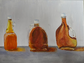
For the theme “sticky situation”, I first thought of things that are sticky, such as honey, syrup, glue, gum, etc. Then I went on a tangent about hard, difficult, or “sticky” situations such as the Great Molasses Disaster, or a car stuck in the mud. I decided the composition would look better if there were multiple little things rather than try to make repetition in a situation. So I went with a still life. 
I liked the gum stuck to a shoe idea, but repetition would be hard to incorporate, and gum packets and honey seemed too original so I went with maple syrup. The media I used was acrylic which worked really well for the syrup colors. I could mix the colors to match my references, and the colors also blended well, allowing me to show the highlights and lowlights in the syrup. The paint also dried relatively quickly so I could put a layer of paint on and move to the highlights all in one day. I also got to use the matte medium which allowed me to thin the paint a little, and help make the shadows more bendable. 
I really liked using this media, even though it was a risk I took in the project. It was hard to work with, and blend, but it made the different colors of the syrup a challenge. To incorporate repetition I did a still life with multiple bottles (3) each had a different shape and darkness which made it interesting, but they were all maple syrup bottles, creating repetition. The mini lessons also helped a lot during this project, because I learned how to add highlights and low lights without just adding white or black to the paint. 
I learned to add colors that are opposite on the color wheel to darken, and add a yellow, or lighter shade of a color to highlight. The bottle painting on the black paper help to teach me how to use the white as a high light, and the watercolor lesson helped with layering and incorporating in other colors.


The "Student Spotlight" posts are excerpts taken from our student blogs. 
You can see more of Claire's art here!
You can see all our student blogs here!

Friday, October 25, 2013

Sticky Situation : Repetition Part 2

 
The Art Two class is wrapping up their third project of the year and closing out the first quarter. The task was to show repetition, their theme was Sticky Situation, and their medium was their choice of type of paint.

 .
Uhm, I thought I said paint.


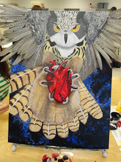
Are those real feathers cause I thought I said paint. 


At the completion of a project, we all display our work on Feel Good Friday. We have food and drinks and cupcakes. Each artwork has a comment sheet for people to write words of encouragement. 

This time we added to Feel Good Friday by including breakout sessions. These breakout sessions gave students a chance to discuss their work with a small group of their peers.


 Above you see Bailey discussing her work. This was her favorite part of Friday! She really enjoyed the small breakout sessions. Look at that smile. Seriously overjoyed!


Buckets aren't sticky. I don't get it!


One time I was staying at a beach house and I saw a cat eating a tree frog. This painting reminds me of that cat.


This painting was created with stencils and spray paint.  This is the before painting for the
antelope artwork that isn't a painting, above.


Cara painted a self portrait.. if she had button eyes.

Thursday, October 24, 2013

Student Spotlight: Sanjna - Art Three

Intertextuality Project - "Twilight" to "Ilight" 


My first idea for the intertextuality project was the one that I went along with. The idea was to change the cover of the book "Twilight". In the actual cover, there are two hands holding an apple. I wanted to change it so that the hands would hold an iPhone, from the company "Apple".


 In order to make the final product look very realistic and exactly like a book cover, I decided that my medium would be computer art. First, I took a picture of another person's hands holding an iPhone. I used a spotlight in a dark room in order to get a good light effect. I uploaded the picture on to Photoshop, where I darkened the background and added some effect in order to match the original cover. 

I changed the title from 'Twilight' to 'Ilight' because all of the products in the Apple company begin with 'I'. I also changed the author's name to Steve Jobs because he founded Apple. I also extended the new cover outward in order to match the dimensions of an actual book cover. Finally, I designed the side of the book, printed it out, folded it accordingly, and put it around an actual Twilight book.


 I took a risk in this project by using computer art to make my final product. The reason this was a risk was because I was not very familiar with this medium. However, I was able to learn a lot about the different tools on Photoshop from doing this project.

The "Student Spotlight" posts are excerpts taken from our student blogs. 
You can see more of Sanjna art here!
You can see all our student blogs here!

Monday, October 21, 2013

Repetition : Sticky Situation


the Art Two class is hard at work creating their third project of the year. The task was to show repetition, their theme was Sticky Situation, and their medium was their choice of type of paint.

Above we see some practice painting of some very sticky gummy bears.


Before each student started painting they wrote down lots of ideas. from these ideas they created some thumbnail sketches to decide what would be their final painting. Wouldn't want to get stuck with that!


Bubbles can be very sticky.


As can bubble gum. Lots of repetition there!


Literal stick.


The leaftailed lizard lives on a stick.


Sometimes the plugs on a flute get stuck.


Every rose has it's thorn.. don't get stuck.
Wait... I thought this was a painting project!!???

Thursday, October 17, 2013

Art 1 Face Swap

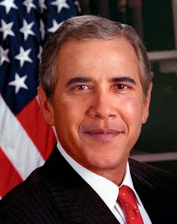
Obama's face on Bush's body
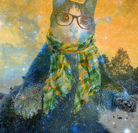
 Art 1 tried out a fun mini project today in Ms. Sudkamp's class.  Most of these students have never used Photoshop before and are just starting to understand the editing software.  Using this awesome tutorial the students became familiar with layers, cropping, blending, and moving within photoshop.  Hopefully more to come soon!
Hipster Kitty Bear